Mobile Website Design: Key Checks to Lower Bounce Rates on Small Screens
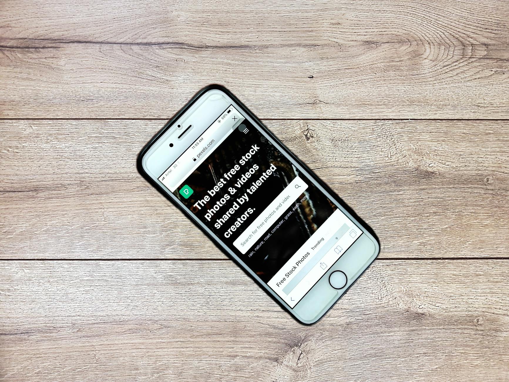
Photo: Alif Sagor · Pexels
It is always frustrating to watch visitors land on your business homepage from their phones and close the tab within seconds. Often, text that looks great on a desktop becomes tiny on a smartphone, or visitors struggle to tap buttons because their fingers hit the wrong spot. Tweaking your mobile website design can noticeably increase the time visitors spend on your pages. Let's go through the practical checks you need to make so visitors don't bounce away from your small screens.
Start by Rechecking Font Sizes and Line Spacing
Content created strictly for desktop monitors rarely translates well onto a smartphone screen without adjustments. To keep scrolling and reading effortless, maintain a readable body font size and ensure generous spacing between lines to prevent eye fatigue. If sentences stretch out too long, readability drops, so configure your layout for natural line breaks that fit mobile screen widths.

Place Core Buttons Within Thumb's Reach
The primary actions visitors want to take upon landing on your site include booking, inquiring, or calling directly. If these crucial buttons are tucked away in a corner or hard to find, visitors will grow tired and leave. Position them prominently in the bottom area or center of the screen where a thumb naturally rests when holding a smartphone with one hand, allowing users to proceed effortlessly to the next step.
- Check if the body font size is comfortable to read on default smartphone screens without zooming in
- Place primary action buttons, such as call or book, in prominent, easy-to-reach locations for single-handed use
- Reduce large image file sizes appropriately to prevent slow loading times on mobile devices
- Break down unnecessarily long paragraphs into shorter chunks to eliminate visual clutter
Capture Attention Through Spacing and Image Ratios
Cramming text and images closely together on mobile screens creates a cluttered feel that drives quick bounce rates. Leaving adequate breathing room between various elements is a core principle of mobile website design. Additionally, configure photos to scale automatically to the screen width to prevent them from getting cut off on the sides.
| Check Item | Before Revision | Recommended Direction |
|---|---|---|
| Body Font | Small text under 12-14px | Increase to 15-16px or larger |
| Button Size | Plain text links | Touch-friendly boxed buttons |
| Loading Speed | Heavy original photos | Web-optimized images |
Mobile Optimization is the First Step to Converting Visitors into Customers
With the majority of traffic now arriving via smartphones, the polish of your mobile experience directly impacts your revenue. For small business owners and solo entrepreneurs, adjusting every single spacing element manually can feel tedious and difficult. Using AI website creation tools automatically delivers clean layouts and button arrangements built specifically for mobile environments from the start. If you want to fine-tune specific designs or spacing yourself, browse through made site examples to find a configuration that fits your industry.
FAQ
What should I do if the text appears too small on smartphones?
Body text smaller than 15-16px on mobile screens harms readability. Adjusting your font settings through your dashboard or AI agent chat ensures appropriate scaling across all smartphone devices automatically.
Why is there a delay when tapping buttons on the site?
This usually happens when overly high-resolution original photos are uploaded or unnecessary scripts are tangled together. It is vital to optimize images to web-standard file sizes and maintain a clean layout.
Put it into practice
Describe what you need and your website is ready in minutes, with blog marketing running every day.